3D Graffiti - Creative
This design is the second semi wildstyle design that I've created. It's not really all that wildstyle but technique of folding and layering the lettering in 3d is wild enough for me. This style is tricky because you can't just design it in 2d and bring it across into 3d without planning how you want the lettering to appear in 3d space. This really just means knowing which part of the lettering overlaps and what part you want to be behind.
This design follows on from 'skeme using the same techniques that I used in that design but translated to work with this style. I've started to get into blocking out the depth in my lettering using layers instead of one shape, this seems to work really well when you bend the lettering so that you can see under the 3d shape as you get the effect of a 'core' layer or a layer that is sandwiched between two other layers. This also seems to work really well when you turn the inner layer into a light emitting shape as it illuminates the lettering from the center and creates some interesting light effects.

I spent a lot of time on the texture for this work even though it looks just like a simple metal texture it is actually a composite with about 10 layers. From the base stainless steel to a grease layer and a sort of brown/blue overlay color to get some color into the metal. It also has a bump layer applied so that the texture catches some of the light. Again getting the lighting right on a metal object in a black space is actually rather tricky...In this design I ended up using a lighting rig of 8 lights pointing in various directions to get it to look right. I've been reading up on studio lighting techniques to improve my design work and have learned a lot from some photography books.

Side view of blue core
This view shows the dimension and layering to the depth of the letters. Really happy with the way that this work turned out it seems to be well balanced and the lighting seems to work.

For this composite I wanted to get a bit more hardcore with my work... This was shot in Brisbane for a new development on a cold and wet day. I really lliked the whole vibe of the industrial building/cranes and 'road closed' sign. Added a lot of layers (perhaps too much) but I wanted something darker than all my previous works to match the style of graffiti.
3D Graffiti - Prime

Working on pushing a sharp style of 3d graffiti. Also getting my work to have a lot more dimension and curve, something that is pretty tricky in 3d.
Started with only a few shapes in this design then built out (similar to 'Droid). I wanted to balance the two main shapes far left and far right to create an angle to the work. The texture is just a modified version of my defualt 'cool metal' texture - which is something that I created in psd to have a few different types of metals (and bump maps) in the one PSD so it's easy to reuse.
Added a blue light to the scene to give it a colder feeling, seems to work well with sharp metal.

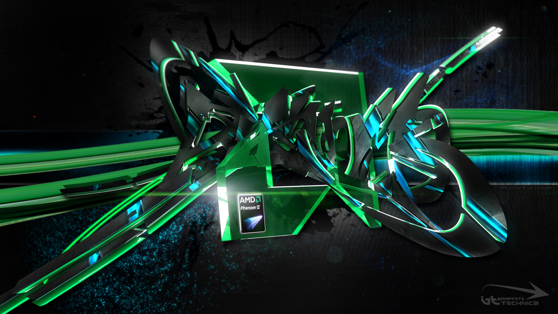
3D Graffiti - AMD Phenom Overclocking Wallpaper
Phenom - is the third work in the series for overclocking/hardware wallpapers. This work is based around the AMD CPU series Pheonom (as in the word phenomenon). A rather tricky starting point as there really is no branding or design around the CPU itself - rather plain font and just the blue light effect. So I decided to make the graffiti design stand out by using a very complex style.
Not really concerned with the legibility of the lettering with this one as there seems to be a balance between legibility, shape, color, and lettering. So with this one I pushed the shape and color at the expense of the other two.
Download as HD 1920 x 1080 wallpaper
The graffiti shape itself is based on a cross pattern with the two main arrows wrapping from the back to the front which was hard to do as you can't obscure too much of the lettering else it just looks like a mess.. Originally I had intended to wedge the CPU in between the foot of the 'E and the left foot of the 'M (where the 'O is) as I intentionally made the two apposing shapes create a matching negative space.

Download wallpapers:
1920 x 1080
2560 x 1600
1440 x 900

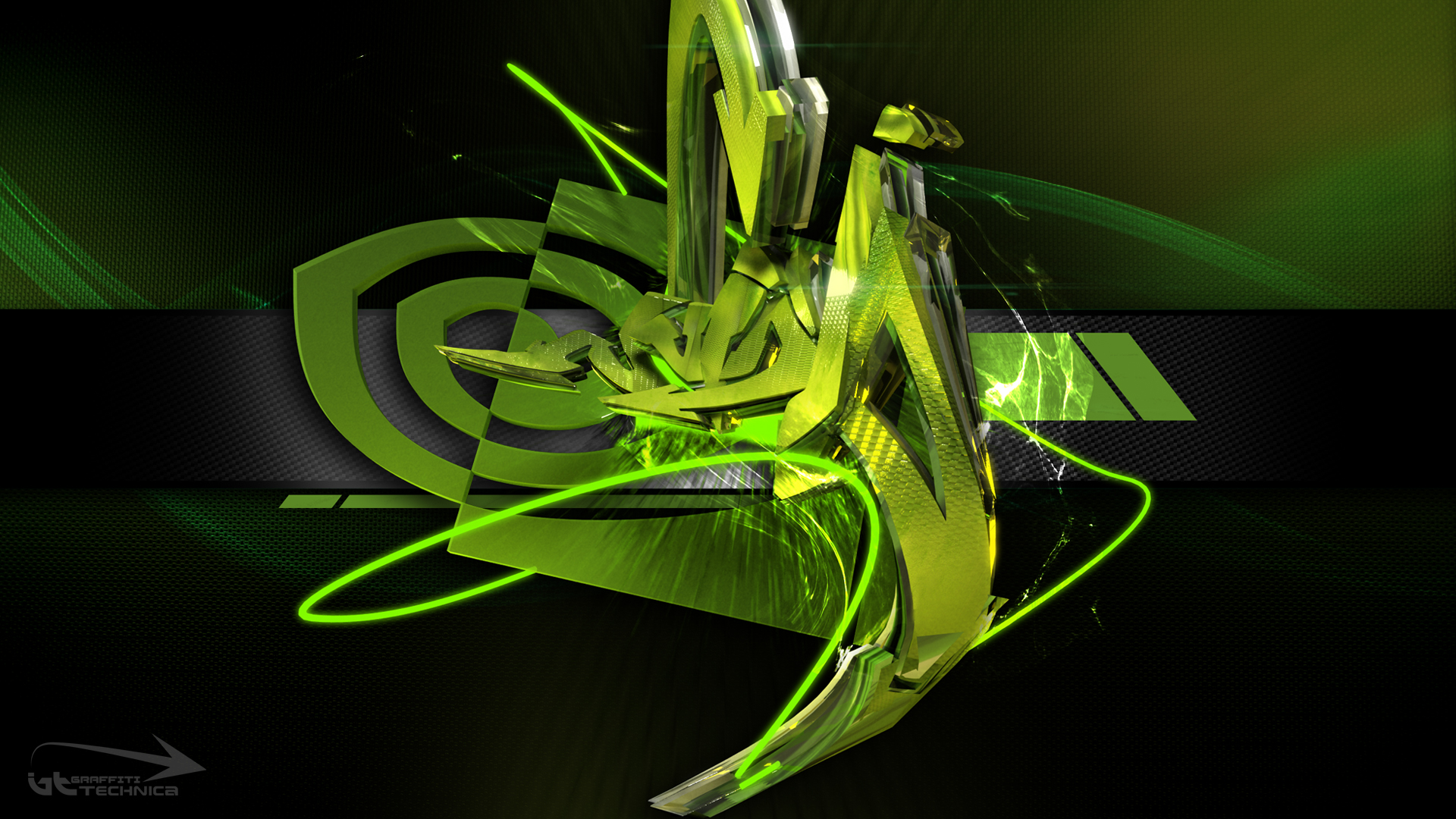
Close up of chip
The colors - obviously limited to the palette of the logo and brand itself. Had to use more blue than I would have liked in this one as too much bright green makes it look like an xbox logo. I always try to stuff as much of elements from the source (in this case the amd logo) into my graffiti designs to try to make it match as close as possible to the style I am working with. In this one I added the giant AMD green logo smack bang in the center - it works for two reasons. One - it is rotated in 3d space in the opposite direction to the lettering. Two - its a big square which balances the mess of the curves in the design itself.
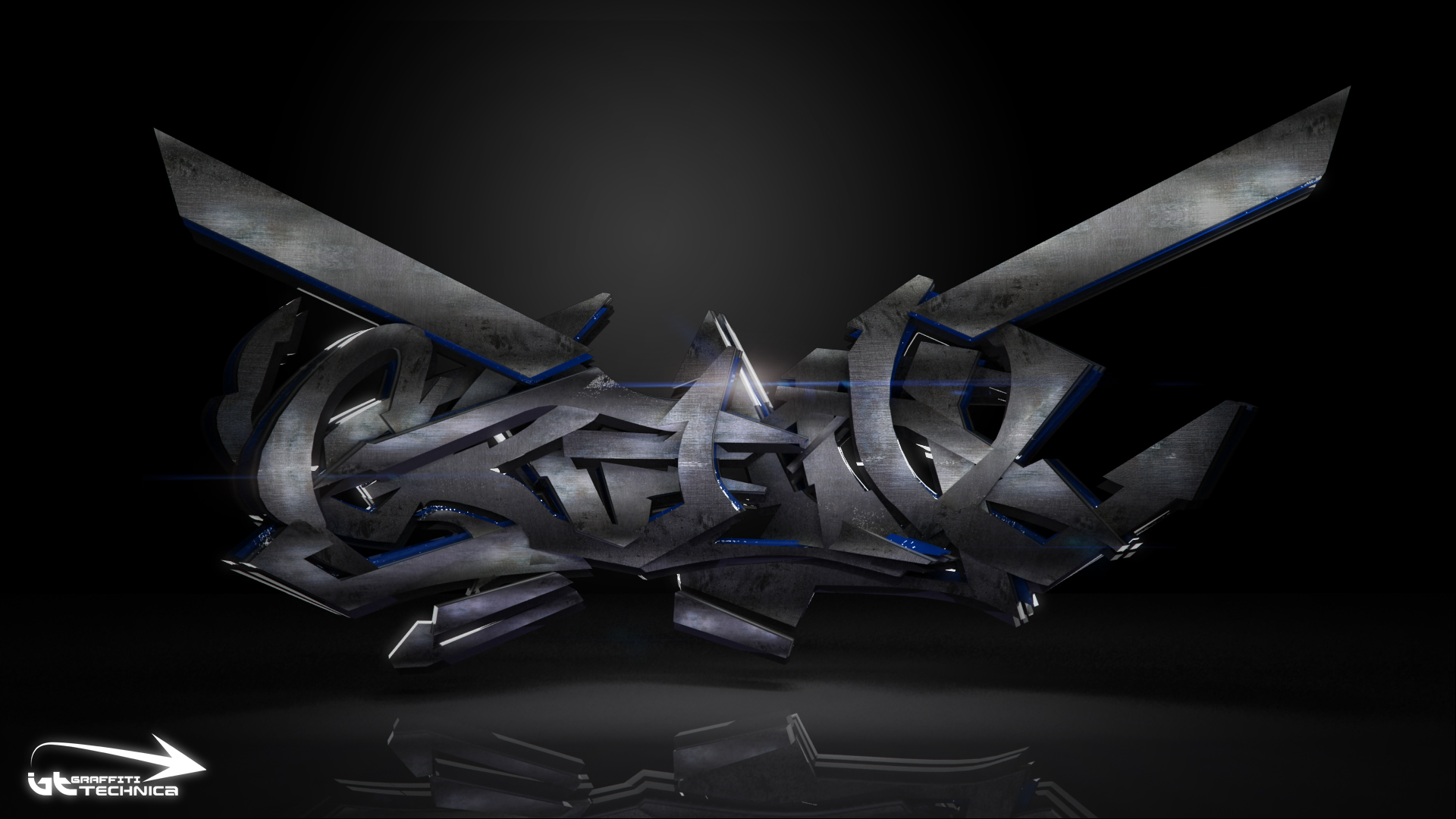
3D Graffiti - Deadline
So this one is again using a more complex style than my previous works. It comes from a series that I have been working on trying to get a handle on wildstyle in 3d.

The colors for this were based on the 'Technica design that I did as one of the first graffiti designs on the site. I really like the black and red combination - it gives the graffiti a sense of evil. I also wanted this one to have a mechanical feel so as per all my works lately - grey and steel looking.

Close up of 'e and texture
Didn't want to make anything easy about this work so the texture had to be as complex as the letters. It actually took a lot of time to get a fairly simple texture - rendering wildstyle is actually quiet hard as certain textures just don't work for some reason. Also certain camera angles don't work as just covering up one little curve can completely change the work.
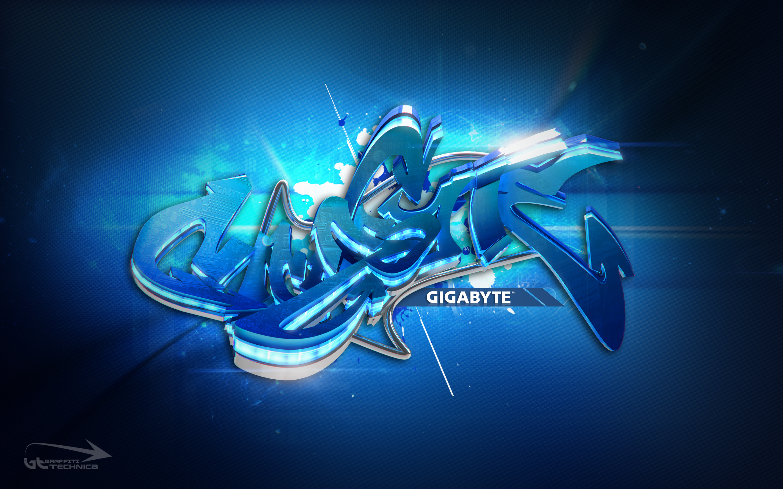
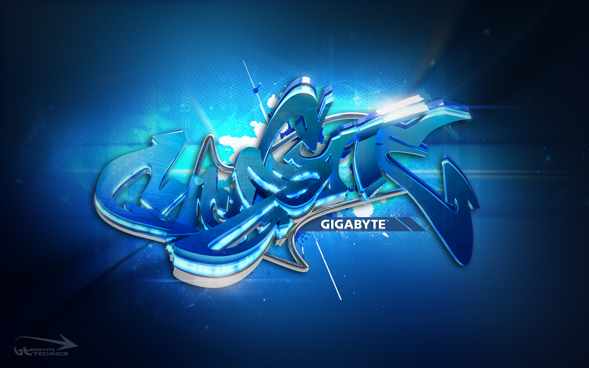
3D Graffiti - Gigabyte Wallpaper
So this wallpaper is based on the company Gigabyte. They have some very definite styles to their branding so it makes it so much easier to design with.
I don't usually like working with words over about 5 letters as graffiti design makes it look complex enough but when you have a long word it takes a lot of time to get it looking balanced. With this one I tried a few different lettering styles but in the end went with a fairly simple style but made sure the work had a certain flow to it. I wanted this design to be more graphic art than 3d graffiti as gigabyte branding uses a lot of gradients and vectors.
The color scheme is based on some of their motherboard color designs. The board itself is actually a deep blue - almost like car paint. I also got the idea of the pipe cooling from one of their board designs. They have some really metallic shiny cooling pipes which look really cool. I also wanted this design to stand out at the higher resolutions so I've added a bump map on the lettering itself of the motherboard. This does a few things - breaks up the gradient, adds some secondary reflections and gives the work more of a mechanical feel.
Download wallpapers:1920 x 1080
2560 x 1600
1920 x 1200
1680 x 1050
1440 x 900
1280 x 1024

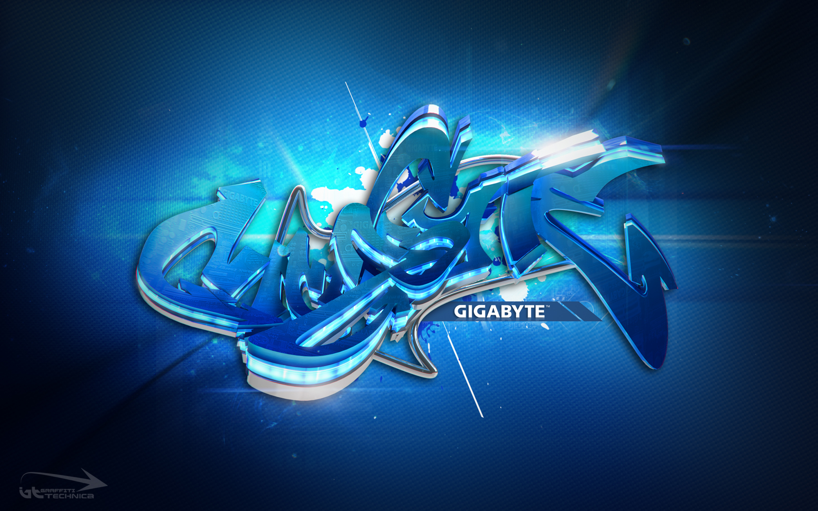
Close up of 'A and texture
Tried a new technique of adding a light source to the inner core of this design. The texture is actually a series of blue LED lights. I thought it would match the Gigabyte style perfectly.
3D Graffiti - Droid

I started off this work with just a basic outline of a sketch with blocked out dimension of where I wanted the letters to be and in what direction they would be facing. I wanted to keep a compact shape to the lettering so that it appears to be one semi-joined object rather than separate lettering.
The inspiration for this work was of course robotic design. I have been researching a lot of mechanical and industrial design lately, I get a lot of idea for my graffiti work from these magazines and books.
I kept color right out of this work as it didn't really need it as the shape and curves were enough. I am starting to use the old design technique of turning your image to black and white so that you can see shape and form and not be influenced by color. Most of the time I end up leaving my designs in BW or at least with a very sparing use of color.

Close up of 'D and 'R
I designed the bowls and the stems of the 'R first as the letters of D R O I D are fairly similar I repeated the same style all throughout the rest of the lettering making minor tweaks to the lengths and angles to create the rest of the letters. As this is graffiti I wanted to take a bit of liberty with the 'O in the design and turned it into a cube. I thought this would match the design as the rest was very angular the square seemed to be the best choice. Maybe could have had some cords and wired coming off the cube but could have been overkill. Maybe even could have turned it into a light that would illuminate the whole scene.
One of the biggest problems that I have with metallic designs is getting the lighting right. Controlling the reflections and at the same time keeping the light on the blacks is the same problem that people have when photographing metal in real life. I usually set up a whole lighting rig that involves bouncing the light sources off white objects it seems to give me the best results for controlling reflections.

Top view of 'O cube
Really like the way the vents or grills turned out in this design. I remember seeing these used in graffiti when I was a kid on some really complex designs. They seem to break up the shapes without actually punching a hole through the lettering and gives the shape an internal dimension.
Tidak ada komentar:
Posting Komentar